Put another way, text layers should use the furthest pixel in each direction as the boundaries for their container.
The current arbitrary edging makes it hard to size and align text correctly without first converting that text to a shape.
Here's an example that shows what I mean:
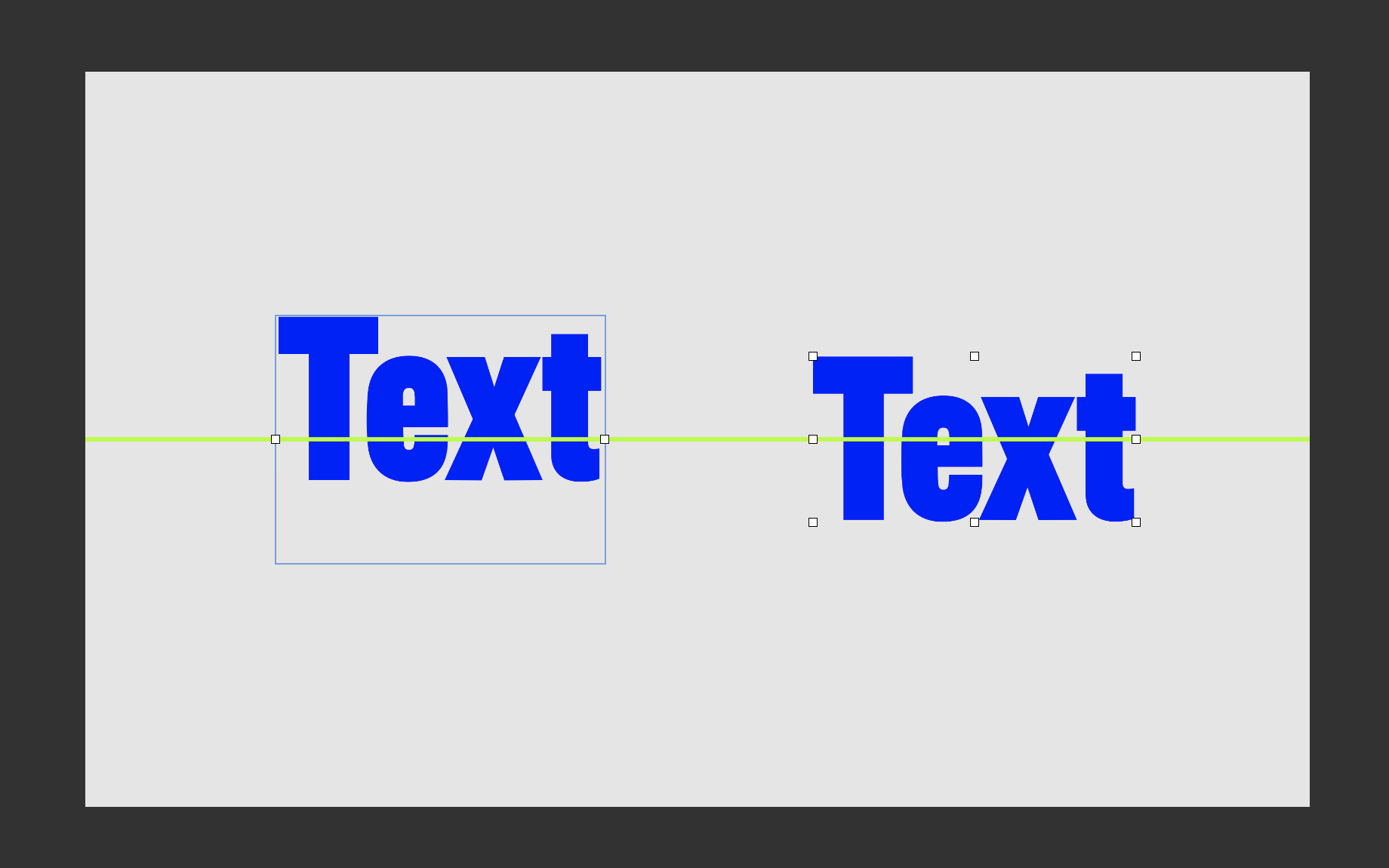
This image has a green line running through the exact horizontal centre.
On the left is a text layer, on the right is that same text converted to a shape.
Using the align tools on the right-hand shape layer to vertically centre the text works exactly as expected - you can see it placed exactly where it should be under the green line.
However, the text layer is visibly off by a long way.