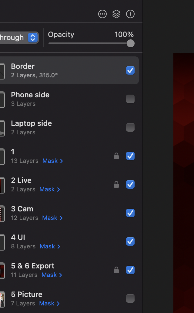
Love all the new updates, but I've noticed that the bright blue in the checkboxes and the word 'Mask' seem to draw some attention away from the content I'm making, and especially when most of the UI is grayscale. Wold be great if they coloring was changed to gray.
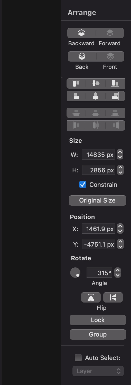
Also, the 'Move' tool, which brings up the Arrange Menu, it takes up more space on my small laptop screen than is really needed anymore:
Was thinking it could be shrunk down by doing something like this ^.