Selecting the "text" and right click-hold translation becomes:
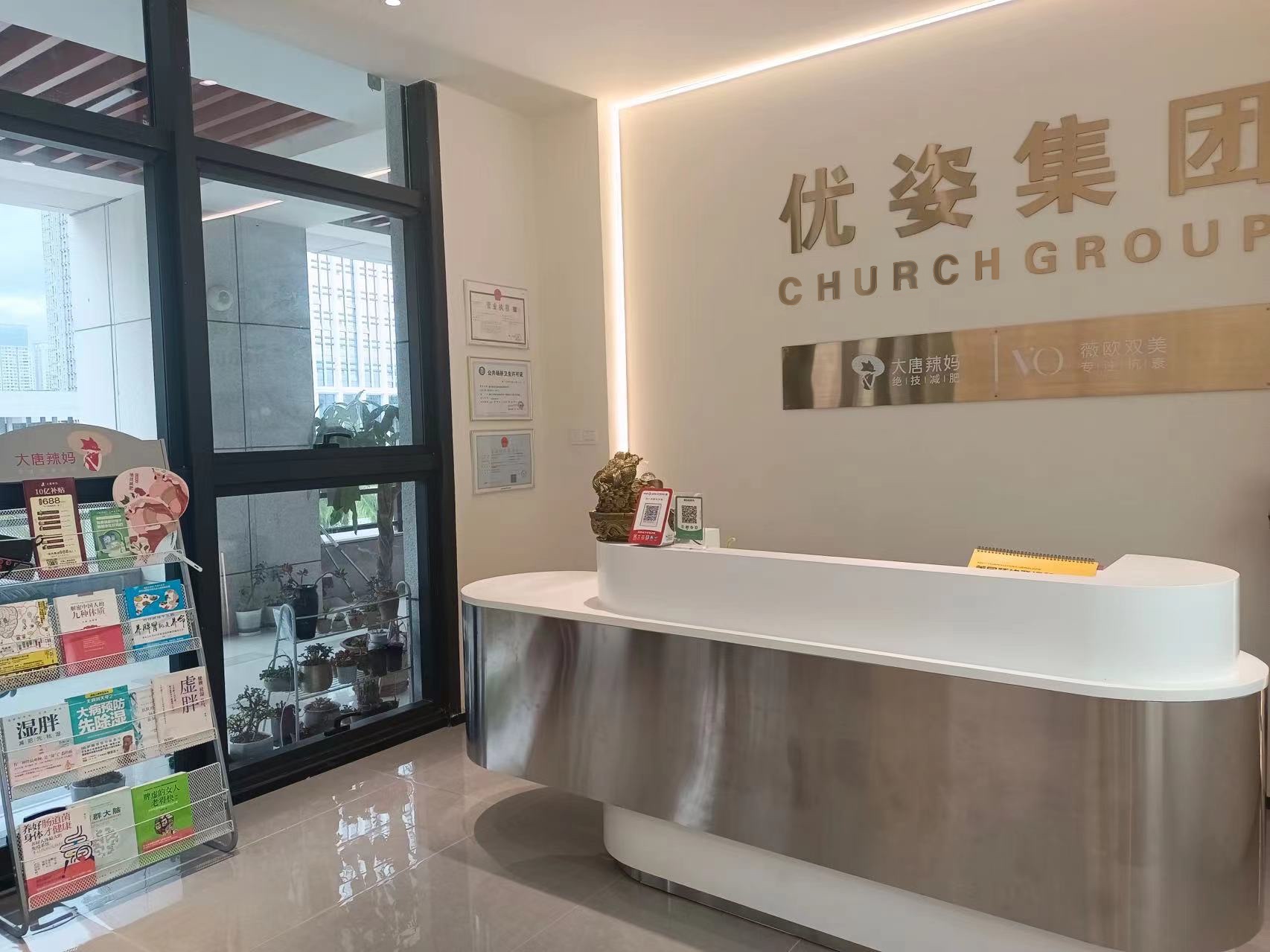
I want to change the words of Youzi Group in the picture to something else, but there should be the original Youzi Group. The effect of these words can't be seen that they were modified by computer. How to do it? Thank you. In addition, when the adsorption tool absorbs the font color, there is a deviation. What should I do?
Comment: I don't know if he's talking about the chinese or english text, and I don't see "Youzi" anywhere, might be the translation.
by mccoytest选择“文本”和右键单击保持翻译会变成:我想把图片中Youzi集团的单词改成别的东西,但应该有原来的Youzi集团。这些单词的效果看不出它们是被计算机修改的。怎么做?谢谢您。此外,当吸附工具吸收字体颜色时,会出现偏差。我该怎么办?评论:不知道他说的是中文文本还是英文文本,我在任何地方都没有看到“Youzi”,可能是翻译。[/引用]
Further thought...
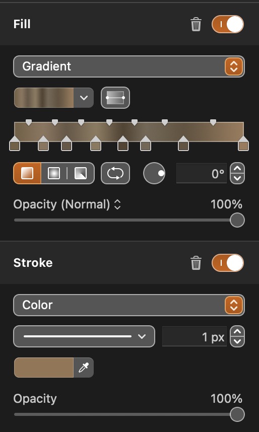
I copied the wall directly below ugrace and moved/pasted it over the ugrace text - made it partially transparent so I could see letters and spacing. I tried a couple of methods - I traced the individual original letters and copied the ones I wanted and fabricated the letters I needed and resized as required. That was okay - but not that good. Next, I added 'CHURCH' text and tried to space them properly. I converted them to shapes and moved them out of the container to modify them individually with perspective transform. I converted them to pixels, selected and merged them and created a gradient fill based on the colors of the graphics above/below 'CHURCH' to simulate the shading. I also created a 1 pixel median color stroke to sharpen the letters a bit. I removed transperancy of the wall paste. This is what I got - it was fun. I'm sure you can do better, and even know what you are doing! I used CHURCH because it was six letters and had several letters that were needed of the ugrace letters.