No more black interface in Pixelmator
2014-04-25 00:32:22
Besides a more grey UI a big wish for usability would be *larger* fonts. The small labels are ultra hard to read 8(

2014-04-29 14:01:34
I like the idea of choice colors...
Also I wouldn't mind having the different tools / palettes attach so that they don't get lost in the pile - click an arrow to open / close that section. so all pieces are in one place
Also I wouldn't mind having the different tools / palettes attach so that they don't get lost in the pile - click an arrow to open / close that section. so all pieces are in one place
2014-05-17 02:31:18
I agree that the black interface with colored icons is a BAD combination. It's very hard to see and it doesn't bring any value to the interface. I prefer a more flat design interface with gray scale icons. I think the app developers should give us the option to choose a theme and maybe the ability to build custom themes.

2014-05-17 16:02:43
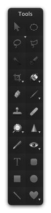
I ran a black&white filter over all the tool icons and scaled them so that the icons don't break any borders in the palette.
Here are the files if anyone else wants them: https://www.dropbox.com/s/fu2sz9ydrbz1g ... _tools.zip
You need to place the files to Pixelmator.app/Contents/Resources.
Just remember to backup the original files in case you want them back or if something goes wrong.
Here are the files if anyone else wants them: https://www.dropbox.com/s/fu2sz9ydrbz1g ... _tools.zip
You need to place the files to Pixelmator.app/Contents/Resources.
Just remember to backup the original files in case you want them back or if something goes wrong.
2014-05-28 01:49:03
Another vote for a dark gray option. I love Pixelmator but the inky black interface makes my eyes hurt after a while. Not being able to see window edges is not something I would ever do to my users.
I agree that the tool icons could be more distinguishable (especially the tiny purple smudge that is the magic wand). Ironic that someone has lovingly handcrafted all of the tool icons at a size that makes them very hard to see and appreciate.
But the thing that makes me have to put away Pixelmator before I want to is the black window frames.
2014-05-29 13:57:57
I sympathize with those having a hard time with the dark interface. For the most part, I'm comfortable with it, but I can see that some might want things less dark. I've spent many happy hours in Lightwave, Final Cut Pro and Blender, all three of which feature a darker interface...not AS dark as Pixelmator's and some level of adjustability is offered.
It's a tough thing, because while I also find dark/black type on white/light background easier to read, I also find it fatiguing to have 2 square feet of white white blasting away at my face for 8 hours, too!
I'd vote for: keeping current Pixelmator interface, plus adding an option for those who want a less dark one, for the very sound reasons cited.
2014-06-09 09:29:09
testing trial version , I agree, what is the best solution is allow customer to change colour of interface in prefs thus making everyone happy, try reading black with a glossy hi res screen on macbook pro, its like a mirror
2014-06-09 14:44:37
chiming in on this issue...again..
1. Please keep the current, dark interface.
2. Please offer an option for those who want a lighter interface.
Same goes for icon and type sizes...I find everything perfectly readable, and I am (supposedly) in an age group which finds things hard to read. I have no clue what it takes on the dev side to achieve these changes, but enough people are having a hard time with the interface that I feel it bears attention.
Also, please not that neither the Pixelmator interface, nor the website are "black." This is a very dark gray, I'd suspect a dark warm gray. If the background were black...real black, as in rgb(0,0,0) your eyes would truly start bugging out after 10 minutes.
As long as we're throwing "expert testimony" at this problem, I've been using these things for 30 years. I am sick and tired of having 3 square feet of white blasting out at me all day long. I embraced the trend toward darker interfaces that seemed to arrive in the Mac world maybe about 10-ish years ago. Many of those "dark" apps offer some level of user configurability. Notable examples: Lightwave 3D and Blender 3D.
In the latter, you have control over virtually every atom of User Interface you could possibly imagine. I changed the Render progress bar from gray to red, but most the rest of the color looked right on to me.
I'm not sure who the usability specialist/expert poo-bahs are who would have dark interfaces removed from the computerscape, but judging by the large number of applications now rocking dark UIs, they appear to be out-voted!
Cheers!
whippin

2014-06-10 22:08:59
This isn't even the default Mac OS GUI - this is a custom designed interface. You can find this out if you try out the OS X 10.10 preview.

2014-06-12 17:47:12
+1 for Yosemites Dark and(!) Light mode
2014-06-14 11:39:35
Hi Pixelmator Team,
I am working a lot with photo and video editors and when I start a project, I can literally sit for hours at my desk in fromt of the screen. However, as much as I like Pixelmator 3.2, the "BITCH BLACK" theme and the tiny little nano fonts require me to focus and concentrate so much on reading and finding tools that my eyes hurt within an hour.
I have the high end iMac with 27" screen and another two lower resolution monitors daisy-chained to it and although I work in full screen with all windows open, I have serious issues reading the tiny information provided, e.g. status bar, tool or filter labels etc.
Here are two features that would make Pixelmator a even more competitive replacement to PS CS series for many enthusiast pixel artists;
1. Additional user preferences/settings allowing to change font size for menu, labels, status bar etc at least between small, medium and large.
2. Additional user preferences/settings allowing to change the color theme between dark (black),medium dark (dark grey like in Final Cut Pro X) and light grey, or to be able to adjust the gamma.
Otherwise great engineering work.
2014-06-15 14:57:44
Count me in too. I don't hate the black interface but it is causing me problems while editing dark images. I cannot tell where the image ends and the margin/fill space begins. While trying to do pixel accurate manipulations this is a big pain point. I'd like to be able to select the margin/fill color for image windows.
2014-07-14 03:59:21
A black interface and tiny text combination is AGE DISCRIMINATION.
I just bought this. I'm going to be creating book covers for the books I'm writing during retirement - and I have a gigantic monitor so I can SEE things - but a black background as the ONLY option is very difficult to work on with OLD EYES.
PLEASE give us an option for simple black text on a white or gray background - it has to be a very simple fix for you - and an impossible one for users.
THANKS. I'll dedicate one of my books to you if you do it.
Alicia Butcher Ehrhardt
2014-07-25 16:17:46
Guys, I have some good news with the release of Yosemite ! You can take a look here : http://www.pixelmator.com/blog/2014/06/ ... /#comments
QUOTE : "That’s right, we are going to work on a new Pixelmator version for OS X Yosemite right away. So I suspect that you’re going to see some user interface changes."
The bad news, however, is that we have no idea what they are up to for a new interface. Is it just to include glass-looking translucency all over the place like Apple has done in Yosemite, or is it to lighten the interface a bit ?

2014-07-27 05:48:04
I'll add my vote for a "light mode" wherein the Pixelmator UI is much lighter than the current UI. I love Pixelmator and I feel that this wonderful app would benefit greatly from such an option. Dark UI's are just too difficult to deal with for some folks.
2014-07-31 08:03:42
Please bring an option to allow an interface with dark text (black) on light background (grey). Light text on dark background as it is now the case (white text on black) is hard to read for people. Please also allow larger font in the interface, because on high resolution screens, the interface is so small that it's hard to read.
2014-07-31 12:13:36
I'll just say -- I'm loving the existing dark UI interface a lot, so please do not remove it entirely!
2014-08-06 12:26:31
I agree with FuriousFingers.
2014-09-08 20:26:04
It could be lighter (while still being dark).
2014-09-23 22:19:23
Hi Pixelmator Team.
I'm a new user and another refugee from Photoshop. Wanted to say how much I've been impressed by your app - it's been a pleasure to use and the wealth of tutorials has made it all the more enjoyable. Good work and special thanks to Sebastiaan!
A couple of suggestions I'd like to offer: First re the UI: I too find the black BG and small text challenging though I like the overall effect. Perhaps you could consider using the same colour scheme as Apple does in FCPX and Motion. Having spent many hours on them I've found them comfortable to use. They seem to have hit on a good combination of dark UI and font size (which would not change the look of Pixelmator much).
Second, I found a pdf Pixelmator Manual for Version 1.6. As I need to be away from internet connection fairly frequently having a pdf manual is a great help. Would love to see an updated version.
Thanks. Looking forward to what you come up with next.
2014-09-26 01:55:53
A guess: maybe the pixelmator update for Yosemite will overhaul the UI, make it flatter and perhaps not as contrasty.
I quite like the design direction of the photos app in Yosemite:
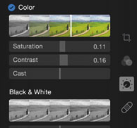
It would make sense to align the design of Pixelmator with the Photos app.It is dark, but not as dark as Pixelmator and is quite flat. I wonder how the style of the icons on the right will suit the Pixelmator's tool panel. The icons are not distracting at all, but easily identifiable even though they are so minimalistic and in grayscale. That might be a bit difficult for Pixelmator to pull off with so many different tools, would be nice if they do manage to pull off something like this :)
(I snagged the picture from: https://thephotosexpert.com/tips/2014/6 ... tments-bar )
I quite like the design direction of the photos app in Yosemite:
It would make sense to align the design of Pixelmator with the Photos app.It is dark, but not as dark as Pixelmator and is quite flat. I wonder how the style of the icons on the right will suit the Pixelmator's tool panel. The icons are not distracting at all, but easily identifiable even though they are so minimalistic and in grayscale. That might be a bit difficult for Pixelmator to pull off with so many different tools, would be nice if they do manage to pull off something like this :)
(I snagged the picture from: https://thephotosexpert.com/tips/2014/6 ... tments-bar )
2014-10-14 19:42:16
I would like to add my strong suggestion for the ability to choose the palette/interface colour, to make it lighter and easier to read/see.
This is especially important when I'm on the road and needing to work on my laptop.
Otherwise, love the program!
This is especially important when I'm on the road and needing to work on my laptop.
Otherwise, love the program!
2014-10-16 23:04:09
I would like to slightly change my position on the Pixelmator interface...Overall, I am fine with the darkness. However, I feel that some things, like text labels of tools menu bar, etc, could stand to be lighter against the dark.
The issue is one of contrast. while I can see all of these text bits, I sometimes have to...not exactly squint, but look closer or take more time to make sure of what I'm seeing.
If text were a bit lighter, and therefore, more contrast against their background, I feel that User experience and efficiency would be greatly enhanced, and work fatigue reduced.
whippen
2014-10-17 09:27:18
I personally prefer a darker interface. It's why I like Pixelmator over Photoshop (not to mention no recurring monthly subscription fees). Also, similar to Adobe Lightroom, the subdued back is less eye strain versus constantly having shocking white eye strain in the face. When one goes to a movie theater (cinema depending where your from) they don't turn on all the lights for one to watch a movie. The darkened theater/cinema atmosphere allows focus on the movie and be more readily drawn into the cinematic experience. I reckon the best solution is to have an option to allow users to chose which color they prefer to work in... For example: 'Bright Lollipop orange', or 'Le Noir', or whatever.
2014-10-23 01:35:20
Photoshop gray is much better.
I have Pixelmator set as my default app as I am trying to ditch Adobe.
Grey would be great.
I have Pixelmator set as my default app as I am trying to ditch Adobe.
Grey would be great.